Vietnamese Moon
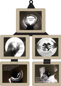
This started as a photography project and gradually grew into my attempt to create an interesting visual design. The moon is important to me and these photos were meant to share some of my feelings about it. My friend Kate wrote some ambiguous stuff to go with it and I designed the layout.
SP Kitchen
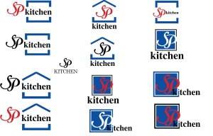
A relative of my boyfriend asked me for some ideas on a logo for her new restaurant, SP Kitchen. She wanted a box, SP in calligraphic type, and let me choose the rest of the elements involved. These were some of the ideas I ended up sending her. I have no idea which one she may have finally chosen, but the top center one is probably my favorite.
Pattern Monster
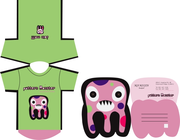
Pattern Monster was one of my all-time favorite projects. I came up with a product/company idea, then a name, then a logo, and it just got more fun every step of the way. This was one of the designs done for that project, a playful twist on the idea of a promotional postcard.
Mariah Magazine Page
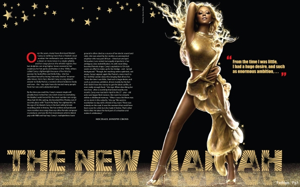 Years ago I was supposed to create a spread for a magazine. I wanted to do it on music and at the time she was popular so I did a little research and learned a lot of new tricks in Photoshop and Illustrator putting this together. I had a lot of fun carrying the color and flash of her outfit down into the titular background.
Colorado Art Ranch
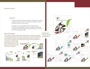
With Type II, I kept a process journal of a lot of work I did over the semester for this project. We were asked to come up with an identity system for the Colorado Art Ranch and build not only the logo and type design choices but entire magazine pages. After learning a little about the Ranch I played a lot with a rocky theme and had fun with the abstract look of it.
Sailor Moon
When I took color theory, I chose to use Sailor Moon (an anime I have liked since I was very young) as the basis for some of my exercises. Because of its cartoony nature, it was a good platform for color exploration. When I started learning to color in Illustrator, this was one of my earliest attempts and Sailor Moon was my test dummy again.
Denver Zoo
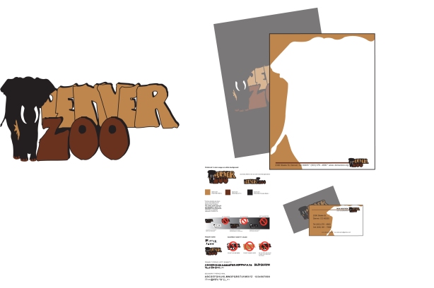
A few years back, I was given a project to attempt coming up with a fresh idea for a Denver Zoo identity system. I went with earthy colors and a big, stone-henge-like font that I thought gave the idea of a sort of bold safari adventure.
Travel Guide Cover
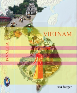
In case you haven’t figured it out yet, I am originally from Vietnam. When asked to reinvent a book cover, I chose to work on a travel guide for Vietnam. It was fun playing with the iconography, color, and other visuals of my home country for this little project.
Typography Book Cover
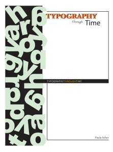
When I took typography, I designed this cover for an actual book. My favorite part was designing the left-hand jumble. I like how after a while looking at it, your eyes realize that you are looking at a messed up version of the word “typography.”
Bauhaus Music
I made this poster for a class about two years ago. I was really interested in Bauhaus design because of how clean and simple it could be while still retaining a viewer’s interest, so when we were asked to make something based off a popular/historical style of design, guess what I did? I had a lot of fun interpreting my “music poster” in the Bauhaus style of design through graphic elements, typography, and color.

